Intro to Data Analysis
Once you have data collected it is helpful to visualize it to begin analysis. This is where the Python data anlysis tools are extremely helpful.
Data Visualization
For more advanced data analysis options
- Jupyter notebook and Google Colab work with pandas, numpy, matplotlib, seaborn, etc in a notebook style. You can execute snippets of code individually and view data tables and plots. This allows you to work on small sections of code without having to execute the entire thing.
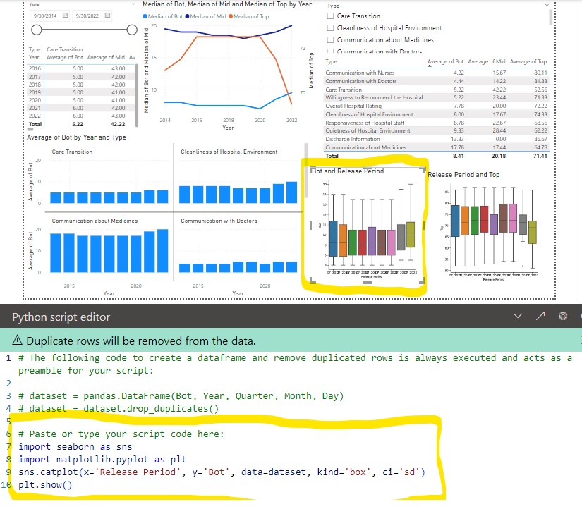
- Power BI (microsoft windows based). Can import data from databases, csv, JSON, etc and do basic plotting with microsoft tools. Can add R/Python scripts to do more advanced box plots, histograms, heat maps, etc with plotly.
- dash is Python based dashboard using plotly to do advanced box plots, histograms, heat maps.
- Python in excel allows you to enter python code in an excel formula bar and execute it. You can then output the plot or table into your spreadsheet. An advantage of this is you can both visualize the raw data tables while leveraging off pandas to quickly duplicate, transform, and perform statistical functions on the data. It also give you access to all the python plotting and statistical tools. If you already have python/jupyter/dash code for reports you can now copy these into excel (or Power BI).
The general workflow I have found useful is
- Excel with Python for initial data analysis
- Jupyter Notebook or Colab for deeper analysis and/or starting to create automated workflow
- Python-dash for full automation of the analysis
- Power BI for presentation
Pandas
Pandas is a python library (built on top of NumPy) that provides a tabular structure to your data for most of the advanced data visualization tools. Typically one of the first steps you will do is import your data from a database, spreadsheet, or csv into a pandas dataframe. From here you can easily duplicate the dataframe, modify, create pivots, format columns, add data, etc. An advantage of this is you can easily/quickly transform your data without affecting your original database.
Convert to Pandas df
df = pd.DataFrame(object)
Convert df to numpy
array = array.to_numpy()
Replace NaN with none
df.replace(np.nan, None)
Use clip to convert negative numbers to 0
df = df.clip(lower=0)
Use mask to replace numbers with another number or NaN or a blank
df = df.mask((df[0] > 68) | (df[0] < 63), np.nan) # can use '' to replace with blank
See datatypes (3 methods)
df.dtypes
df.info(verbose=True)
with pd.option_context('display.max_rows', None, 'display.max_columns', None):
    print(df.dtypes)
append new values
newdata = pd.DataFrame({'Xmm':0, 'Ymm':-150, 'Rmm':150}, index=[0])
df = pd.concat([newdata,df.loc[:]]).reset_index(drop=True)
Looping through columns and modifying data types
for name, values in df[['PEB', 'DVLP']].items():
    df[name] = df[name].astype(str)

for name, values in df.iloc[:, 0:2].items():
    df[name] = df[name].astype(str)

for name, values in df.items():
	print name(col name), value

for col in df:
    if col == 'DVLP':
        for i, row_value in df[col].items():
            df[col][i] = row_value * df['views'][i]
Filtering on a single column
# Filter Rows Based on condition
df[df["Tool"] == 'CD101']
df.loc[df['Tool'] == value]
df.query("Tool == 'CD101'")
df.loc[df['Tool'] != 'CD101']
df.loc[df['Tool'].isin(values)]
df.loc[~df['Tool'].isin(values)]

# Filter Multiple Conditions using Multiple Columns
df[(df['CD'] >= 50) & (df['CD'] <= 70)]
df[(df['CD'] >= 65) & (df['PEB'] == "PEB15" )]
dfcntr = df[(df['Lot'] == lotID) & (df['Wfr'] == wfrID )]

# Using lambda function
df.apply(lambda row: row[df['Tool'].isin(['CD101','CD102'])])

# Filter columns that have no None & nana values
df.dropna()

# Other examples
df[df['Tool'].str.contains("CD101")]
df[df['Tool'].str.lower().str.contains("CD101")]
df[df['Tool'].str.startswith("CD1")]
Drop/remove columns from dataframe
df = df.drop(['Date', 'Target','LS','US'], axis=1)
dataframe to dictionary (with list)
dict = df.to_dict('list')
dataframe to numpy array
x = df.iloc[:, -1].values # last column only
Pivot table
df = df.pivot(index="Xmm", columns="Ymm", values="Th") # rows/index will be Xmm and columns will be from Ymm and values will be Th
 df = pd.DataFrame(client.query_api().query_data_frame('from(bucket: "esp2nred") |> range(start: -5d) |> pivot(rowKey:["_time"], columnKey: ["_field"], valueColumn: "_value")'))
    df = df.drop(columns=['result', 'table', '_start', '_stop', '_measurement', 'device'])
    df = df.assign(date=df['_time'].dt.strftime('%Y-%m-%d'))
    df['date'] = pd.to_datetime(df['date'])
Results = multi.pairwise_tukeyhsd(df['tempf'], df['location'], alpha= 0.05)  # Use multi pairwise tukey HSD
dftukey = pd.DataFrame(data=Results._results_table.data[1:], columns=Results._results_table.data[0])
dftukey['reject'] = dftukey['reject'].astype(str)
table_tukey = dbc.Table.from_dataframe(dftukey, striped=True, bordered=True, hover=True) # use bootstrap formatting on table
# Create summary dataframe with statistics
dfsummary = df.groupby('location')['tempf'].describe()  # describe outputs a dataframe
dfsummary = dfsummary.reset_index()  # this moves the index (locations 1,2,3,4) into a regular column so they show up in the dash table
'''dfsummary.style.format({   # this would work if the values were floats. However they
    "mean": "{:.1f}",         # were strings after the describe functions so had to use
    "std": "{:.1f}",          # the map function below
})'''
dfsummary.loc[:, "mean"] = dfsummary["mean"].map('{:.1f}'.format)  # format as float. see comment above
dfsummary.loc[:, "std"] = dfsummary["std"].map('{:.1f}'.format)
dfsummary.loc[:, "50%"] = dfsummary["50%"].map('{:.1f}'.format)
dfsummary = dfsummary.set_index('location').T.rename_axis('location')
dfsummary = dfsummary.reset_index()
print(dfsummary)
table_summary = dbc.Table.from_dataframe(dfsummary, striped=True, bordered=True, hover=True) # use bootstrap formatting on table
Create a summary for a specific column
dfsummary = df.groupby('Tool')['CD'].describe()  # describe outputs a dataframe
dfsummary = dfsummary.reset_index()
dfsummary = dfsummary.set_index('Tool').T
dfsummary = dfsummary.reset_index()
dfsummary.describe()
dfsummary
A Pandas DataFrame is a two-dimensional data structure that can store data of different types. A Pandas Series is a one-dimensional data structure that can only store data of one type.
Feature DataFrame Series Data type Two-dimensional One-dimensional Data types Can store data of different types Can only store data of one type Index Can have an index Must have an index Columns Can have columns Cannot have columns Slicing Can be sliced by rows and columns Can only be sliced by index Iteration Can be iterated over by rows and columns Can only be iterated over by index Merging Can be merged with other DataFrames Cannot be merged with other Series Sorting Can be sorted by rows and columns Cannot be sorted by rows and columns Groupby Can be grouped by rows and columns Cannot be grouped by rows and columns Reshaping Can be reshaped into different data structures Cannot be reshaped into different data structures
Change display in colab/jupyter
pd.set_option('display.precision', 2)
pd.set_option('display.max_rows', 50)
Numpy
Scalar: Single value (int, float, str) Vector: 1D Array (use np.array([1, 2, 3])). You can do math operations on vectors
Shape relates to the size of the dimensions of an N-dimensional array
Size relates to the count of elements that are contained in the array
Access inidividual row/col
lotdflt = df['Lot'].iloc[0]
Example to initialize numpy 2D array with 0’s
arr = np.zeros((3, 4))
arr[0][0] = 1
arr[1][2] = 3
arr[2][3] = 5
To convert numpy to python
# Create a numpy scalar
x = np.int64(42)
# Convert to a Python integer
y = x.item()
Replace NaN or 0 with none
arr = np.where(np.isnan(arr), None, arr) # replace nan with none
arr = np.where(arr==0, np.nan, arr)  # replace 0 with nan
Append new data to a numpy
ydummy = [i for i in range(-150, 160, 10)]
ycoord = dfcntr.iloc[:, -3:-2].values  # convert df to numpy array
ycoord = np.append(ycoord, ydummy)
If you have a numpy array and want to convert all of its elements to native Python types, you can use the tolist() method. This method returns a copy of the array as a nested Python list with all elements converted to native Python types.
# Create a numpy array
a = np.array([1, 2, 3], dtype=np.int32)

# Convert to a nested Python list
b = a.tolist()

print(b)  # Output: [1, 2, 3]
Unique and sort
x = np.unique(x)
y = np.unique(y)
x = np.sort(x)
y = np.sort(y)
X,Y = np.meshgrid(x, y)
Z = np.zeros((X.shape))
Math, unique, and sort
R = np.sqrt(X**2 + Y**2)
x = np.unique(x)
x = np.sort(x)
To get shape and to create a 2D array from two single array
x.shape
X,Y = np.meshgrid(x, y)
Z = np.zeros((X.shape))
Mask values
Znew = np.ma.masked_where(R > 149, Z) # create new array from Z and mask values with R > 149
Scipy
Scipy can be used to create artificial datasets
loc: origin of the transform (mean of the distribution) scale: width of the transform (std dev of the distribution) a: skewness/shape, the higher the number the more skewed size: # of pts or rows, col for numpy normal dist
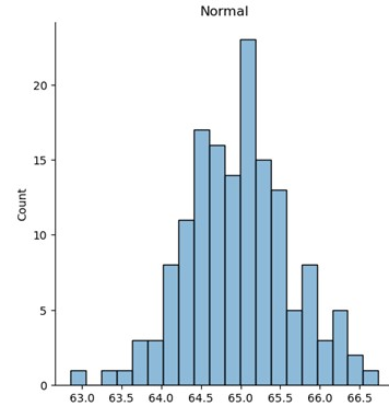
Normal distribution (using numpy)
import numpy as np
df = pd.DataFrame(np.random.normal(loc=ave,scale=sigma,size=20,1)))
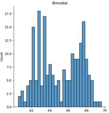
Multivariate (bimodal) distribution
import scipy.stats as stats
cov = [[1, .5], [0.5, 1]]
df = pd.DataFrame(stats.multivariate_normal(mean=[63, 67], cov=cov).rvs(number_sites))
df = pd.concat([df[0], df[1]]).reset_index(drop=True)
plt.hist(df)
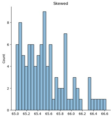
Skewed distribution
from scipy.stats import skewnorm
df = pd.DataFrame(skewnorm.rvs(a=skewness, loc=ave, scale=sigma, size=number_sites))
df = df.mask((df[0] > lower_cutoff) | (df[0] < upper_cutoff), '')  # replace with blanks. Excel did not like NaN
Other methods
pdf - probability density function
pdf(x, mean=None, cov=1, allow_singular=False)
rvs - random
rvs(mean=None, cov=1, size=1, random_state=None)
logpdf(x, mean=None, cov=1, allow_singular=False)
Matplot/Seaborn
Using fig, ax = plt.subplots() creates a figure and set of subplots
- fig is the window that contains the plot(s). Can be used for adjusting the size of the fig and saving to image file
- ax is the axes of the figure. Allows to manipulate the x and y axes.
Figure level function
displot and catplot return a FacetGrid. When columns are added the figure itself will become wider (subplots will have same size and shape). FacetGrid is an object managing one or more subplots that correspond to conditional data subsets with convenient methods for batch-setting of axes attributes.
import matplotlib.pyplot as plt
import seaborn as sns
Boxp/strip plots (kind=’box’ or ‘strip)
sns.catplot(x='Slot', y='CD', col='Tool', hue='Wfr', data=df, kind='box', ci='sd')
displot - figure-level interface for drawing distribution plots onto a FacetGrid
- hist (histogram)
sns.displot(data=df, x="Defects", hue="Tool", kind="hist", bins=30) - ecdf (empirical cumulative distribution)
sns.displot(df, x="Defects", hue="Tool", kind="ecdf") - kde contour (kernel density estimate)
sns.displot(x=df.Xmm, y=df.Ymm, hue=df.Th, levels=10, cmap='viridis', fill=True, kind="kde")
Prob plot
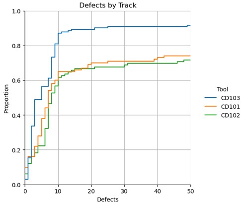
g = sns.displot(df, x="Defects", hue="tool", kind="ecdf") # can use stat='count' to change to counts
# g.set(xlim=(0,50),ylim=(0,1))
plt.title("Defects by Track")
plt.grid(g)
Contour (filled) with a color bar
Note Z must be a 2D array for a 2D image
plt.contourf(X, Y, Z, levels=lvl, cmap='seismic')
plt.colorbar()
3D image
fig = plt.figure()
ax = fig.add_subplot(121)
ax.imshow(
    Z,
    cmap="seismic",
    extent=[np.min(x), np.max(x), np.min(y), np.max(y)],
)
ax = fig.add_subplot(122, projection="3d")
ax.plot_surface(X, Y, Z, cmap="seismic")
plt.show()
Create Z increments
zmin = int(np.floor(np.min(Z)))
zmax = int(np.ceil(np.max(Z)))
zinc = int((zmax - zmin) / 20)

zcflev = [i for i in range(zmin, zmax, zinc)]
zclev = [i for i in range(zmin, zmax, 20)]
zlvl = 10
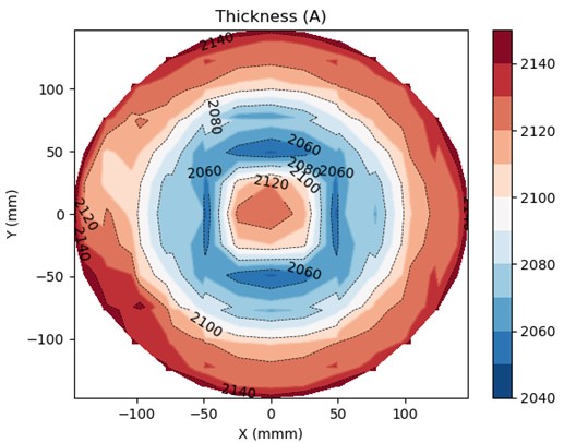
2D Contour plot with contour lines
fig, ax = plt.subplots()

#cplt = ax.contour(X, Y, Z, colors='k', linewidths=1) # k: black
cplt = plt.contour(X, Y, Z, levels=zlvl, cmap='RdBu_r', linewidths=1) # colors='k' for black
cplt = plt.contour(X, Y, Z, levels=4, colors='k', linewidths=0.5, linestyles='dashed') # colors='k' for black
cplt_filled = plt.contourf(X, Y, Z, levels=zlvl, cmap='RdBu_r')

fig.colorbar(cplt_filled) # could also do plt.colorbar(cplt_filled)
plt.clabel(cplt, inline=True, fontsize=10, colors='black') # fmt = '%2.1f'

# Format subplot
#ax.plot(xplt, yplt, 'ko', ms=3) # Marker type-> k:black line, o: marker and ms=3 is marker size
ax.set_title('Thickness (A)')
ax.set_xlabel('X (mmm)')
ax.set_ylabel('Y (mm)')
plt.show()
Interpolated plot
from scipy.interpolate import RectBivariateSpline

# Create some sample data points
xspline = y
yspline = x
data = Zunmasked

# Define the grid for interpolation
xi = np.linspace(-147, 147, 500)  # 101 points for interpolation in the x-direction
yi = np.linspace(-147, 147, 500)  # 101 points for interpolation in the y-direction

# Create a RectBivariateSpline object
interp_spline = RectBivariateSpline(xspline, yspline, data)

# Evaluate the spline at the grid points
zi = interp_spline(xi, yi)

# Create a heatmap of the interpolated data
plt.imshow(zi, extent=(-150, 150, -150, 150), origin='lower', cmap='seismic')
plt.colorbar()
plt.title("Interpolated Data")
plt.xlabel("X")
plt.ylabel("Y")
plt.show()
Seaborn empirical cumulative distribution plot
g = sns.displot(df, x="Defects", hue="Tool", kind="ecdf")
g.set(xlim=(0,50),ylim=(0,1))
plt.title("Defects by Track")
plt.grid(g)
plt.show(g)

sns.displot(data=df, x="Defects", hue="Tool", kind="hist", bins=30)
Seaborn histogram
sns.histplot(data=df, x="Defects", hue="Tool", bins=30)
Python In Excel
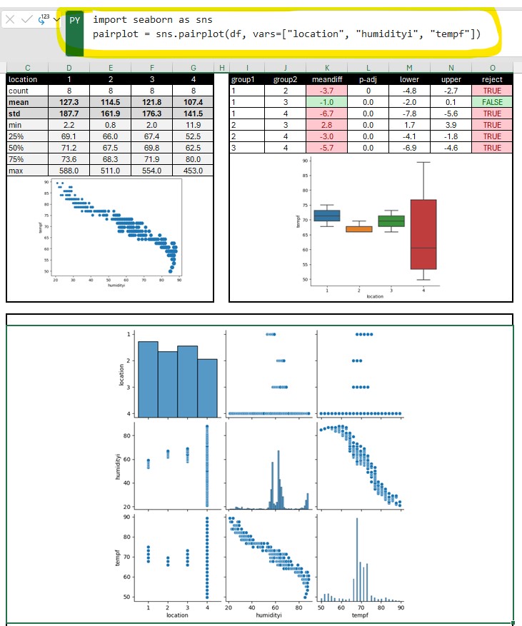
Python in excel allows you to enter python code in an excel formula bar and execute it. You can then output the plot or table into your spreadsheet. An advantage of this is you can leverage off pandas to quickly duplicate/transform data tables without changing the original data. You also have access to the python statistical functions. Also if you already have python/jupyter code for reports you can now copy these into excel (or Power BI).
Examples
df=xl("K1:L130", headers=True)
df.describe()
sns.kdeplot(x=df.Xmm, y=df.Ymm)
Jupyter Notebook
Jupyter Notebook can be installed separately or easily started from anaconda in either windows, mac, or linux. Jupyter uses IPython as a backend (IPython is a dependency of Jupyter). It is a interactive Python interface usually using a web front end.
The ipykernel package provides the IPython kernel for Jupyter. But you can manually create a venv and install it for usage in Jupyter. See Python venv
For VS code to work with Python in Jupyter Notebooks you need to activate an Anaconda environment in VS Code or another Python venv in which the Jupyter package has been installed. (and there is Jupyter extension for vs code) If you don’t want to use Anaconda then (.venv) python3.10 -m pip install jupyter will install the Jupyter system, including the notebook, qtconsole, and the IPython kernel.
Once inside Jupyter Notebook. Example Jupyter flow
from IPython.display import display
import pandas as pd
import numpy as np
from matplotlib import pyplot as plt
import seaborn as sns
df = pd.read_csv("data.csv")
pivoted = pd.pivot_table(df, values='data', index=['file', 'sample', 'sensor'], columns = ['type']).reset_index()
pivoted.groupby(['file']).mean().round(1).drop(['sensor', 'ave', 'delta', 'raw'], axis=1)
pivoted.groupby(['file']).describe().round(1).drop(['sensor', 'delta', 'raw', 'ave'], axis=1)
# Use melt to unpivot
comparedf = pd.melt(pivoted, id_vars=['file', 'sample', 'sensor', 'delta', 'time'], var_name='stat')
a = sns.catplot(x='stat', y='value', col='file', data=comparedf, kind='box', ci='sd')
plt.show()
b = sns.catplot(x='stat', y='value', data=comparedf, hue='sensor', col='file', kind='strip')
# More seaborn options
fig,axs = plt.subplots(1,2, sharex=False, sharey=False, squeeze=True)
g = sns.boxplot(x='file', y='time', data=pivoted, ax=axs[0])
#g.set(ylim=(1500, 2250)) g.set_title('ADC Time') g.set_ylabel('time (ms)')
#plt.title('ADC Average')
#plt.ylim(1500, 2250)
#h = sns.boxplot(x='file', y='raw', data=pivoted, ax=axs[1])
#h.set_title('ADC Raw') #plt.title('ADC Raw')
#plt.ylim(1500, 2250)
#h.set(ylim=(1500, 2250))
#h.set_ylabel('raw')
plt.show()
# Histogram
pi0df = pivoted[pivoted['file'] == 'pi0']
esp32df = pivoted[pivoted['file'] == 'esp32']
sns.distplot(pi0df[pi0df['sensor'] == 0].raw, label='pi0-ch0')
sns.distplot(pi0df[pi0df['sensor'] == 1].raw, label='pi0-ch1') sns.distplot(esp32df[esp32df['sensor'] == 0].raw, label='esp32-ch0') sns.distplot(esp32df[esp32df['sensor'] == 1].raw, label='esp32-ch1')
#fig.legend(labels=['pi0-ch0','pi0-ch1','esp32-ch0','exp32-ch1'])
plt.legend()
plt.show()
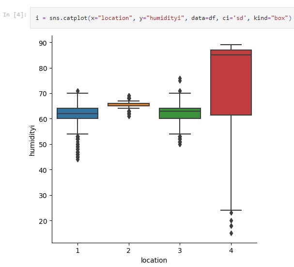
# Seaborn categorical plot. kind="box"
i = sns.catplot(x="file", y="time", data=pivoted, ci='sd', kind="box")
Google Colab
Google colab is very similar to Jupyter Notebook. It is useful for ML since many of the libraries are pre-installed. Can use google drive to store project code. colab
Dash-plotly
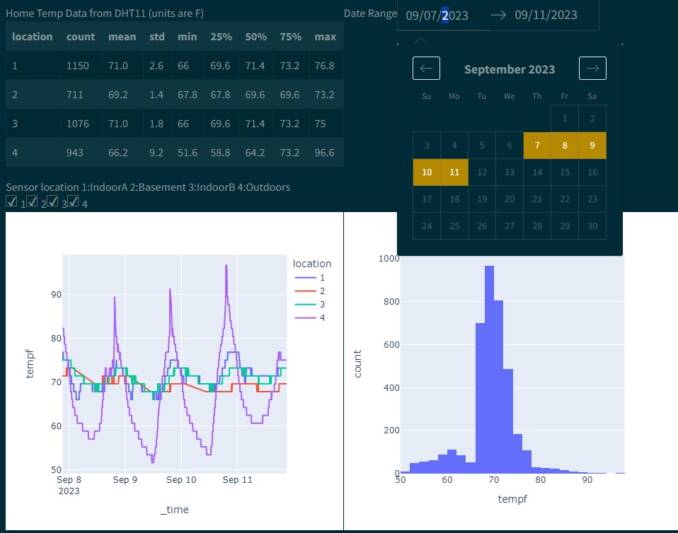
Dash gives more GUI type functions, ie letting a user toggle data series on/off while plotting. Allowing the user to select a row of data and updating a contour plot.
Example of an Engineering Dash Board


$ python3 -m pip install dash
You will create a file called app.py that contains the dash/plotly code.
When you run
$ python3 app.py
It will create a link to view the charts in your browser
Primary components
(initial chart can be plotted with steps 1-3 alone)
- Load css and create dash object
- Define figures (charts. ie fig = px.histogram(df, x=”values”, nbins=1 ), optional text string (markdown), functions(ie to show the data/df)
- Layout (see below.. will use html and core components)
- Callbacks (not required but can be used for interactive charts)
More details
- Layout is a hierarchical tree (dash_html_components)
- Use html components (classes for HTML tags) to create the layout (ie html.DIV, style, etc).
- To place charts use dash_core_components: dcc.Graph(figure=fig)
Callbacks
Callbacks allow for input/output. Makes the charts dynamic and gives you more options for control in the web interface (from dash.dependencies import Input, Output)
@app.callback(Output(output_args), Input(input_args))
def generateChart(x,y):
   fig = px.box(df, x=x, y=y)
   return fig
Packages to import
import dash
import dash_core_components as dcc
import dash_html_components as html
from dash.dependencies import Input, Output
import plotly.express as px
import pandas as pd
Power BI
Power BI (microsoft windows based) is great for clean visualization in a presentation/powerpoint style. It is geared for presenting. It can import data from databases, csv, JSON, etc and do basic plotting with microsoft tools. Can add R/Python scripts to do more advanced box plots, histograms, heat maps, etc with plotly. Only supports importing from pandas (df).
